Virgil Abloh once said that to make something new, you only need to change the original by 3%. It’s one of those quotes that gets passed around creative circles like a permission slip — you don’t have to reinvent the wheel, you just have to turn it slightly differently.
I’ve been thinking about it a lot since finishing a painting inspired by Robert Robinson’s Three Nudes. And while I love the democratizing spirit behind it, I think Abloh was only telling half the story.
How I Found It
I wasn’t hunting for a painting to copy. I was curating.
I’d just finished building out a gallery wall — something I’d been planning for a long time — and I was in the final stretch, looking for the piece that would pull everything together. The wall had a clear aesthetic throughline: Greco-Roman references, classical figures, a certain timelessness undercut by something rawer and more contemporary. It needed one more anchor.
Robinson’s Three Nudes stopped me cold. Classical nude figures — arms raised, bodies mid-turn, unmistakably referencing antique sculpture — but layered over flat color blocks and loose, almost violent mark-making. Spray paint energy over museum content. It was exactly the contemporary-with-classical tension the wall needed.
Only issue: I hated the colors.
The 3% That Changed Everything
Robinson’s palette is bright. Yellow, white, coral red, raw sienna. Airy. Feminine in a way that felt soft to me — and softness wasn’t the vibe I was going for. My wall, my aesthetic, my color story is often built around black and blue. Always has been.
So I inverted the painting. White became black. The cadmium yellows became deep cobalt and olive gold. The coral red accent stripe became aqua blue. Same composition, same figures, same three-part layout — abstract chaos on the left, a central figure against a color block, a second figure on the right with a vertical stripe running alongside her — but the entire emotional atmosphere shifted when the colors did.
I ran both paintings through an AI image analysis tool afterward, curious what the numbers would say. It scored them at 76% similar — high overlap in composition (82%) and subject matter (88%), with the biggest gap in color palette (55%). That 24% delta came almost entirely from one decision: the background.
By Abloh’s math, I changed more than 3%. But his point holds in spirit — I borrowed the structure deliberately and made the meaning in the delta.
The Part Virgil’s 3% Rule Doesn’t Cover
Here’s where it gets more personal, and where I think the percentage framing falls short.
I didn’t just change the colors. I changed the bodies.
The female figures in my version are more generously proportioned than Robinson’s — fuller hips, more curvaceous silhouettes. I call them my “fat-bottomed girls”, and I painted them that way on purpose. I’ve grown tired of the visual language Western art history keeps pushing: thin, white, Eurocentric bodies held up as the classical ideal. It’s everywhere, it’s normalized, and it’s not my body. It’s not a lot of bodies.
When I paint nudes, I want them to look like women I actually see in the world. Women who take up space. Women whose physicality is something to be celebrated rather than minimized.
Robinson’s figures are beautiful. But they live inside a tradition that has, for centuries, decided what a body worth painting looks like. My 3% — or my 24%, whichever way you choose to look at the numbers — included pushing back on that. Same poses, same energy, different bodies.
What Inspiration Actually Is
Abloh’s rule is useful because it gives people permission to begin. It says: you are allowed to be influenced, you are allowed to borrow structure, you are allowed to work within a tradition rather than burning it down to prove you’re original. That’s genuinely liberating, especially for artists early in their practice.
But percentage doesn’t capture where the change lands or why. A 3% shift in the right place — the background color, the proportions of a figure, the temperature of a palette — can rewrite the entire meaning of a work. 97% fidelity applied carelessly is just copying. What separates the two isn’t quantity. It’s intention.
Robinson’s Three Nudes gave me a foundation. The composition, the energy, the collision of classical figuration with raw contemporary mark-making — I borrowed all of it, gratefully. What I did with that foundation was something it didn’t do and, frankly, the Western canon largely hasn’t done: I painted for the female gaze. I painted bodies that look like the women around me. I painted figures that aren’t asking for permission to take up space.
For centuries, the nudes in Western art have been a male-centered project. Men arranged and posed the bodies of their models with the male viewer in mind — not the female one. The classical ideal wasn’t neutral. It was a choice made by people who weren’t in those bodies, repeated so many times it started to feel like fact. Robinson’s work is contemporary and vital and genuinely exciting — and it still lives inside that tradition.
Mine doesn’t. Or at least, it’s trying not to.
That’s not a 3% change. It’s the whole point.
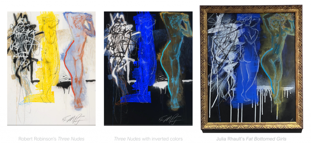
Both paintings are pictured above. The original is Robert Robinson’s Three Nudes. The response is mine — and it lives on my wall.
If you’re interested in similar content to this, check out my series Do I like it or do I just see it everywhere? The series dedicated to figuring out your own taste — what it is, where it came from, whether it’s actually yours — drop a comment below or find me on Instagram, TikTok and LinkedIn ✨